Expressed in Black and White
Do you like b&w photography? Do you create b&w photographs yourself?
I have to admit that fulfilling the theme of b&w photography which I had assigned to July in my 12-month photo project was a real challenge to me. Black & white images can be really powerful and can both express and arouse profound feelings and thoughts but my experience in creating them has been very limited. Actually, I had never taken a photo with the aim of creating a b&w image before, I just tried and transformed a few of my photos when the b&w transformation seemed much more expressive than the coloured version.
When a friend of mine asked me whether I would shoot straight in b&w or whether I would shoot in colour and then I would transform the photos into b&w, I was quite surprised by the question and realised that at the back of my mind I decided this long ago. I shoot in RAW so I get all the data anyway. I might set a b&w preview on my camera but I don’t trust that little screen at the back of the camera much so what would be the point? I wanted to try and see the b&w in the colourful world around me and have the option to get back to the colours if their absence would not work. Shooting to jpeg with b&w settings would seem the worst choice.
I was thinking about how to distinguish the b&w potential and I realised there are many ways. You can look for light and shadows, lines and shapes, textures, tonal contrast or contrast in contents so I tried to find these features in the places I visited. Sometimes it worked well and the photo that I took to be b&w looked good in b&w, other times I was disappointed at the results. Having said that, I’d like to add that even the disappointing results were beneficial as they helped me understand why my expectations didn’t work.
Let’s move from theory to practice, here are five final photos that I created this month and selected to represent the theme:
No. 1: Guinea pig, loved and cared for
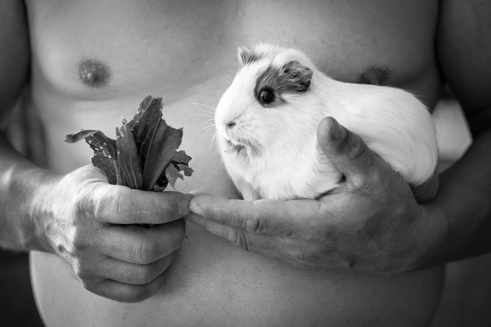
As they say, chance favours the prepared mind, at least sometimes. I took this photo at the beginning of the month to capture the moment but as soon as I saw it on my laptop, I thought it would look great in b&w. Colours are not important here at all and the colourless version tells a more comprehensive story.
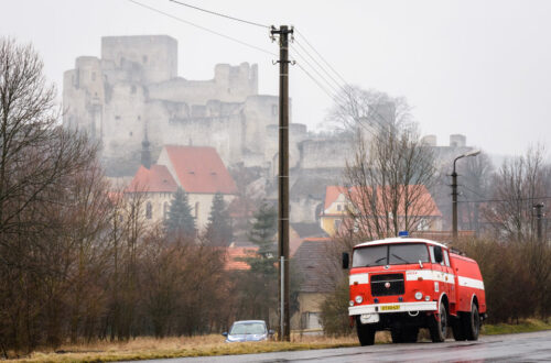
No. 2: Tower & street
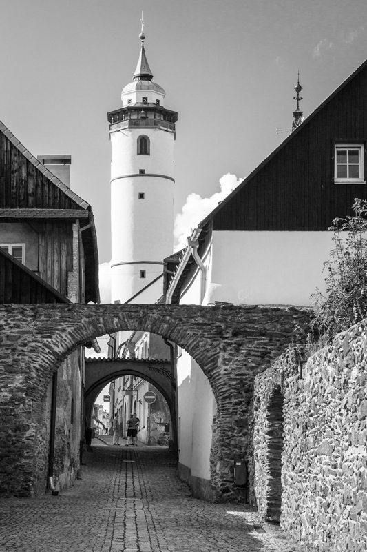
I took this photo in Domažlice, I liked the scene and its colours. I didn’t expect it to look good in b&w and didn’t capture it with that aim. Nevertheless, later I tried to get rid of the colours to see what the image would look like and I find this version much more interesting.
No. 3: Door & alcove

This photo was taken in the former Cistercian monastery in Plasy, the contrast between the door and the alcove looked captivating enough to be presented as b&w. The door to be entered, the alcove to be filled, the door to let you go further if open, the alcove to stop you no matter what. The details in the door and the lack of details in the alcove. Contrast as food for thought.
No. 4: Corridor

The light and shadows and elegant lines felt impressive in this corridor that I also captured in the former Cistercian monastery in Plasy, the scene promised a great b&w image. Although I like the colourful version as well, I prefer this result as the absence of colours highlights the elaborate simplicity of the place.
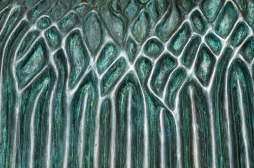
No. 5: Old building
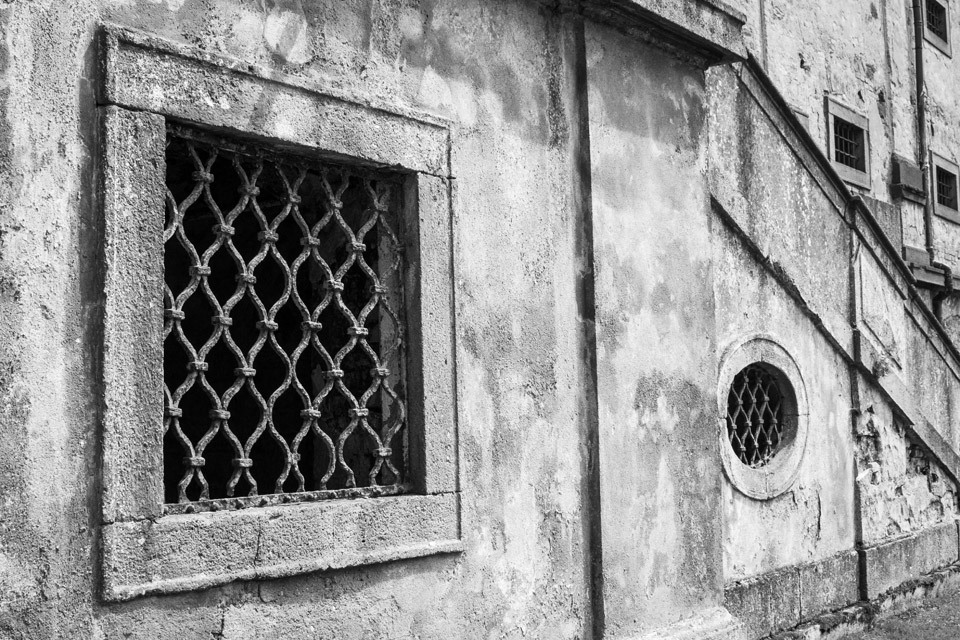
I saw this detail of one of the buildings in the premises of the former Cistercian monastery in Plasy as b&w right away because of the textures and shapes. The resulting image didn’t disappoint me, it even somehow fascinates me. For what is unseen rather than seen in the image?
That’s it. I hope that you didn’t miss colours in any of the images and that my effort and results inspired you to try and see the world around you in black and white for a while to get that different perspective and view.
The theme for August is TIME MEASURING DEVICES (such as clocks, sundials, hourglasses, etc.).
All completed themes of the project can be found HERE.