Geometry
March will be over in just a few days so here I am – in accordance with the rules of my 12-month photo project – with the final selection of five photos representing the theme of the month, which this time was GEOMETRY.
If I had been asked what type of photos I was going to take for this topic, I would have mentioned buildings, pillars, roads and paths. That would have been sort of obvious. Yet when looking for the appropriate captures, I found out that there is more than just the obvious. Of course there is…
Geometry No. 1: Bridges
After having captured the scene, I started to notice that the word “NET” can be seen in many more places in Pilsen, painted on walls in various sizes but the same style. I wonder whether someone just liked the letters of the word, or whether there is another meaning, such as a name of a secret organisation… But I guess I just read too much spy novels…
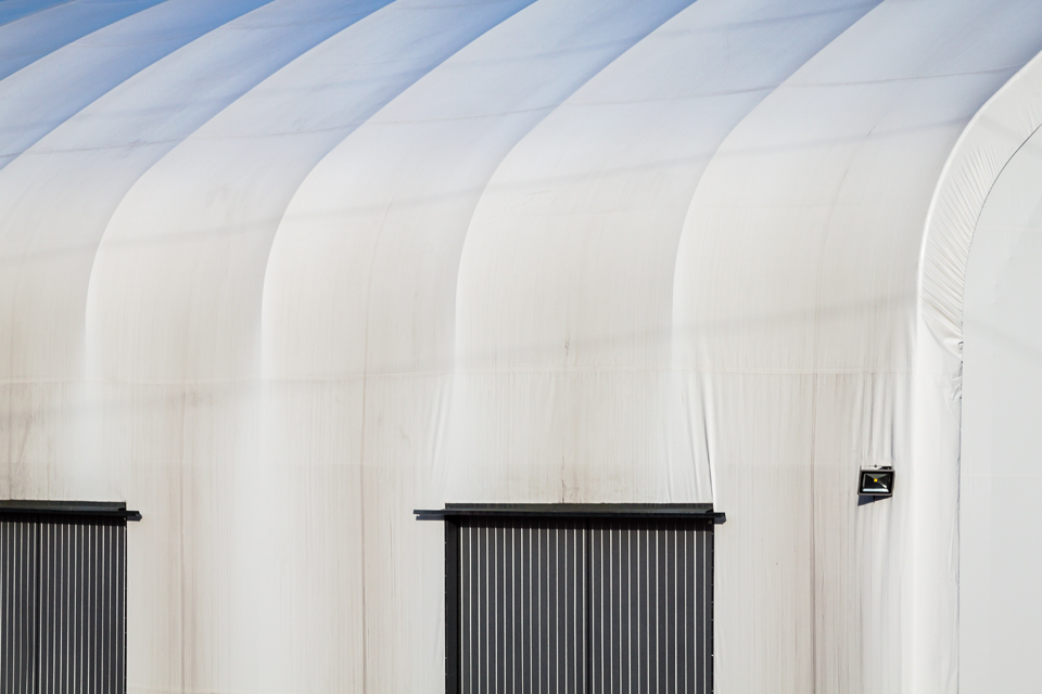
Geometry No. 2: Shadows
The building caught my attention right away but I didn’t take my camera out until on my way back when passing the building again. This might be a warehouse or an assembly shop but that actually doesn’t matter… I’m pleased I got the second chance to catch what I perceived.
Geometry No. 3: Curves
This photo was taken in a park in Klatovy. I hadn’t seen much geometry in the scene until I decided to capture the long building and the paved drainage channel with a wide angle lens that created those beautiful curves in the photo. I know, the building is distorted, but I find the effect interesting in the overall picture.
Geometry No. 4: Minimalist
This photo was taken just a few steps from the previous one and here I saw the geometry right away. I love the simplicity of the scene.
My hubby and I discussed whether the bin should be part of the photo or not and we didn’t arrive at the same conclusion. Would the image be cleaner without the bin or would it be missing something? I prefer it this way.
Geometry No. 5: Pattern
I wonder what you can see when looking at the photo…
I can see steps heading up, lit from the right side, but I know these were just flat tiles of three different colours placed in front of a hobby market as a sample pavement. The optical illusion it creates is perfect but I doubt I would want to have the paving in front of our house.
Well, that’s it, I hope you could see enough geometry in my photos. The theme for April will be RUSTY.
All completed themes of the project can be found HERE.


